Table widget
Path: Widget Gallery> Basic> Table
Use this widget to create a table with data provided from a data source.
To configure a table:
- Put a table widget on the screen and configure the template of the table.
- Add widgets into cells to configure one or more rows that will be used as row templates when the table will be filled with data provided from the data source.
- Select a data source that will be used to fill the rows of the table
- Define the links from widgets and data source.
Configure the table widget
Table widget has two states:
- View mode
- Edit mode.
Click on the table to manage the widget in view mode, double click to enter in the edit mode. To exit and return to view mode click outside the table.
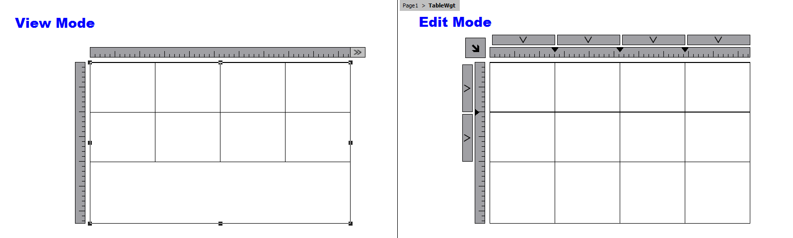
View Mode
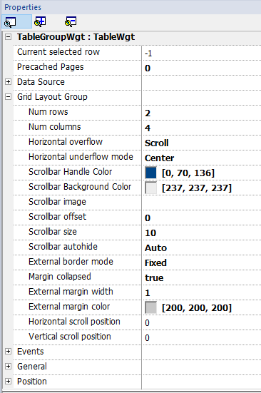
In view mode, you can configure the table layout. Drag and drop the table onto the page, resize the table, define number of template rows, number of columns and the main table properties.
Edit Mode
In edit mode, it is possible configure the format and the content of each cell of the table. Each row of the table will act as a row template.
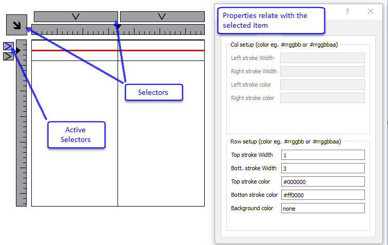
To configure the look of the table, click on table's selectors to select the item to configure.
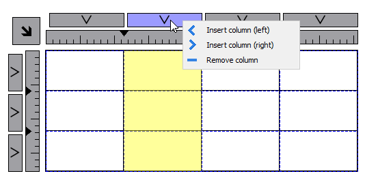
Add or remove rows or columns
To add or remove rows or columns, double click over the grid to enter in edit mode and right click over column or row selector to open the context menu.
Merge or split rows or columns
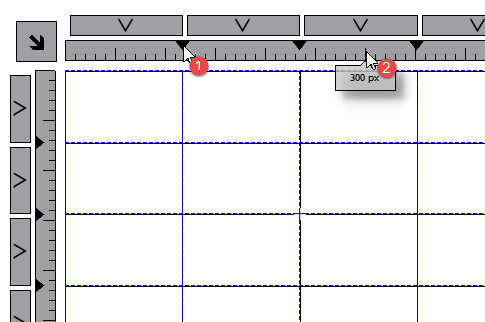
To merge or split rows or columns, double click over the grid to enter in edit mode and move the cursor over the ribbons:
- Double click the black triangle to merge the two adjacent rows or columns (1)
Note that merge is possible only with an empty row or column.
- Double click on ribbon to split the selected row or column (2)
To configure the contents of cells, drag and drop the widgets inside the cells.
If you need more widgets inside a single cell, create a group of widgets and copy the group from the page to the cell.
Configuring the data source
The data source, that provide the data to fill the table, could be a Table Data Source Widget or a JavaScript Object.
Table Data Source Widget
Path: Widget Gallery> Basic> Table
- Drag and drop a Table Data Source Widget onto the page
- Set the Table Model parameter to link at the data source.
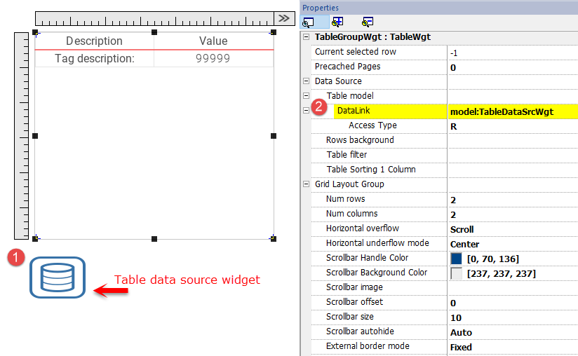
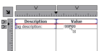
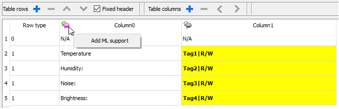
Select the Data Source and inside the TableDataSrcWgt Editor add the rows and columns that are needed. In the following example, we have defined two row templates:
- Row 0
Header of the table. Contains only static text. - Row 1
Template of rows with data. On the first column we added a label that will contain the description and on the second column a field that will contain the value.
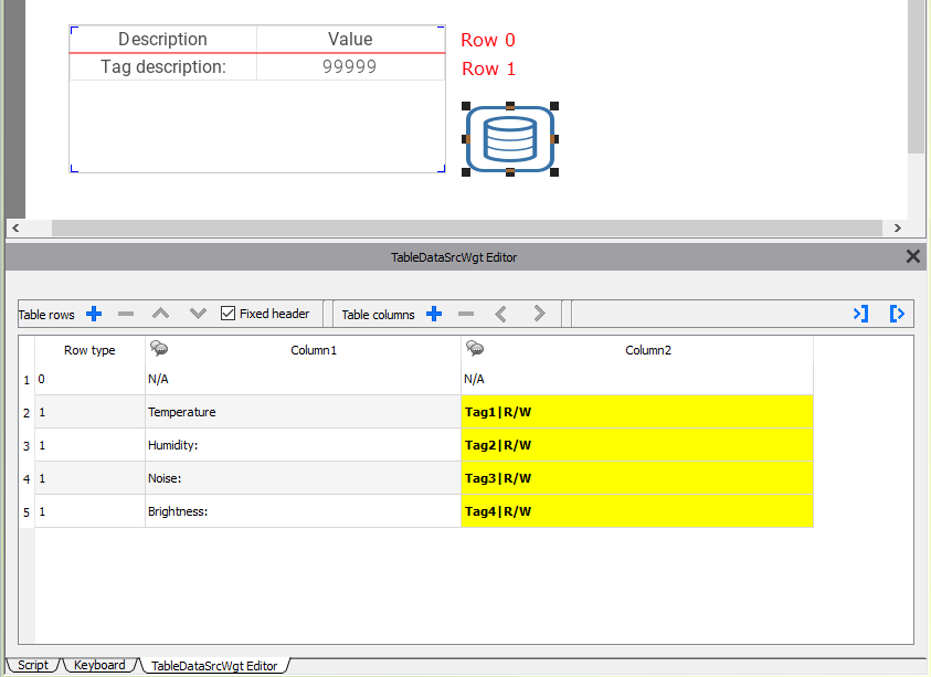
Each row must be assigned a row type. The row will take on the format of the corresponding row template. Widgets that were placed in each cell of the row template will appear in rows of that type.
Define links with data source
- Double click over the Table widget to enter in edit mode and select a widget
- Select the property that is to be read from the data source
- Select the column of the data source that will provide the data
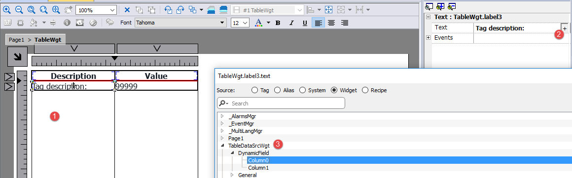
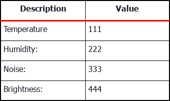
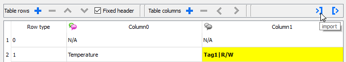
The below picture is showing how our example will be rendered at runtime
Fixed Header
If you want the first row will be not scrollable, check the "Fix Header" check box on Data Source toolbox or set true the "Show Header" propert inside the Data Source properties panel (note the parameter is available only in advanced view).
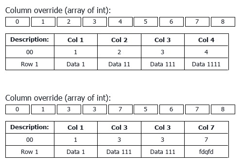
Column override
You can use an array of integers to define or modify the columns order at runtime. When you use this property, be sure to attach an array of integer and set the index to -1 (to select the entire array).
Fetch Mode
When enabled, the table will load a minimal number of rows to fill the view. Allows very fast page loading for large tables. When scrolling, when the table reaches the end, new rows are loaded and you can scroll through the database.
The "Rows loaded" parameter gives you the possibility to choose how many rows need to be loaded per cycle. The higher the value, the longer it will take to load the page, but the more rows will be loaded ready to scroll (less load during scrolling).
Multilanguage
To enable the Multilanguage support right click on the Multilanguage icon of the column. The icon will change color to indicate that the support is enabled.
Avoid enabling the Multilanguage support when not necessary to better performance.
Import/Export Data Source
The configuration of the Data Source can be imported/exported using xml files
JavaScript Object
In alternative to the Data Source Widget, for data to fill the table could be provided from a JavaScript Object. In this case, we have to fill an array of elements with the data to use and assign the array to the table widget.
var myTable = page.getWidget("TableWgt1");
myTable.model = model;
model is an array of elements with the table definition and data. The first element of the array will contain the template of the rows while the other elements will contain the data to fill in the rows of the table
model[0] = row_templates;    // row templates
model[1] = row_data1;        // data of the row1
model[2] = row_data2;        // data of the row2
model[3] = row_data3;        // data of the row3
model[4] = row_data4;        // data of the row4
model[5] = row_data4;        // data of the row5
The row templates is a multi dimensional array where each array defines the datalink of one template row.
On the below example, we have a template for two rows.
var row_templates = {
    _h : [
            [ []       , []        ],   //rowType = 0
            [ ["text"] , ["value"] ]    //rowType = 1
         ]
}
The first row has two columns that do not contain data links. We use this template for the header on the first row of our table.
The second row defines the template of one row with the “text” property of the widget into the first column and the “value” property of the widget into the second column. They will be dynamically filled using the data provided inside the model variable.
On the below example we define a row of data
var row_data = {
    _t : 1,
    _v : ["Temperature:", { _c : "dl" , s : "_TagMgr", a : "Tag1", i: 0, m : 2 }]
}
The first element is the row template to use while the second element is the array with the data to use. In our example “Temperature:” is the text to use inside the widget on the first column, while the other element is a datalink that will provide the value to fill the value property of the widget into the second column.
The datalink element:
| Parameter | Description |
|---|---|
| _c : "dl" |
|
| s : "_TagMgr" |
|
| a : "Tag1", i: 0, m:2 |
Specify tag name and index (necessary when the tag is an array) and the read/write mode
|
The below JavaScript code will generate the same table of the previous example using the Table Data Source Widget
var model = [];

var row_templates = {
    _h : [
            [ []       , []        ],   //rowType = 0
            [ ["text"] , ["value"] ]    //rowType = 1
         ]
}

var row_data1 = {
    _t : 0,
    _v : [],
    _h : true
}

var row_data2 = {
    _t : 1,
    _v : ["Temperature:", { _c : "dl" , s : "_TagMgr", a : "Tag1", i: 0, m : 2 }]
}

var row_data3 = {
    _t : 1,
    _v : ["Humidity:",    { _c : "dl" , s : "_TagMgr", a : "Tag2", i: 0, m : 2 }]
}

var row_data4 = {
    _t : 1,
    _v : ["Noise:",       { _c : "dl" , s : "_TagMgr", a : "Tag3", i: 0, m : 2 }]
}

var row_data5 = {
    _t : 1,
    _v : ["Brightness:",  { _c : "dl" , s : "_TagMgr", a : "Tag4", i: 0, m : 2 }]
}

model[0] = row_templates;
model[1] = row_data1;
model[2] = row_data2;
model[3] = row_data3;
model[4] = row_data4;
model[5] = row_data5;

var myTable = page.getWidget("TableWgt1");
myTable.model = model;
Note the first row (row_data1) contains the directive _h: true to avoid the first line will be scrollable.
var row_data1 = {
    _t : 0,
    _v : [],
    _h : true
}
Multilanguage
A multi languages text can be entered using the below element:
| Parameter | Description |
|---|---|
| _c : "ml" |
|
| mltext : { ... } |
List of couples: "ID Language":"Text" Example:
|
Example:
var row_data2 = {
    _t : 1,
    _v : [ { _c : "ml" , mltext : { "en-US" : "Temperature:",
                                    "it-IT" : "Temperatura:"}   },
           { _c : "dl" , s : "_TagMgr", a : "Tag1", i: 0, m : 2 }
         ]
}
Row background color
Using the Rows background parameter is possible define the column of the Data Source Widget that will contains the background color of the associate row.
To configure the background color of the rows of the table:
- Add a new column inside the Data Source Widget to contain the background color of each row
- Configure the “Row background” color parameter of the Table to point to the color column of the Data Source Widget
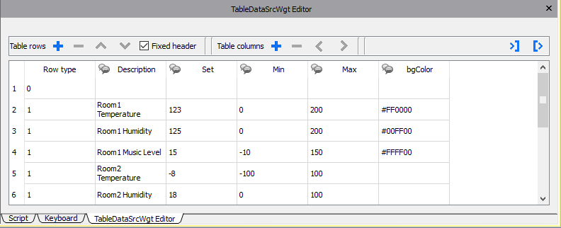
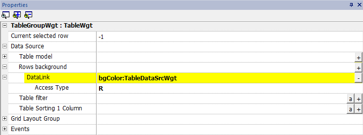
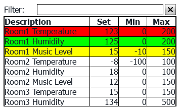
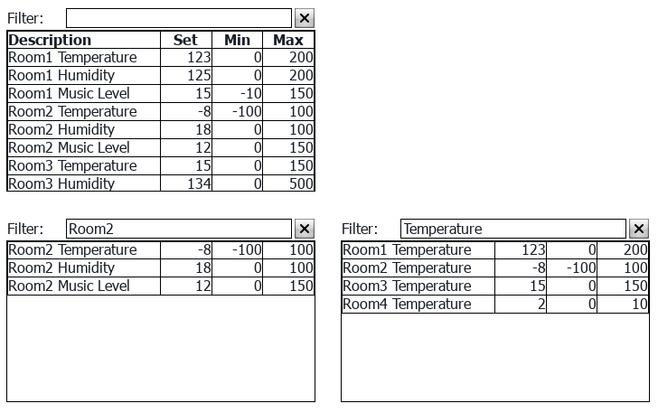
Table Filter
Content visible inside the table can be filtered using the “Table Filter” property. On datalink you can use a formula (see "Formula" chapter for additional details) to define the criteria to use to filter the data.
Each row of the table will be visible only when the Datalink of the Table Filter return true value.
Example 1
If you want choice to see only the rows that contain “something” inside the Description column, you can use the below formula:
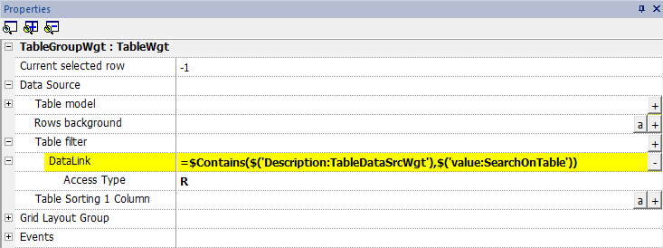
=$Contains($('Description:TableDataSrcWgt'),$('value:SearchOnTable'))
Where
- 'Description:TableDataSrcWgt' is a Dynamic Field of the Data Source Widget used from the table to identify the column to check
- 'value:SearchOnTable' is the value of a text field that will contains the string to search
Example 2
To use flags to define the parameters to expose inside the table:
First, add a new column inside the Data Source that will contains the flags that will enable the associate row. Then, link the datalink of the table filter to the new column that contains the flags
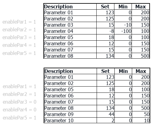
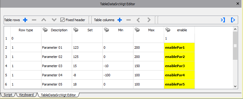
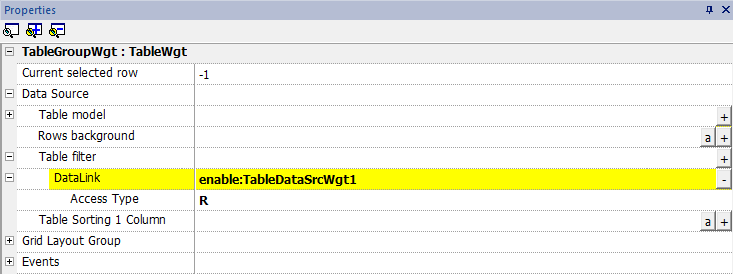
Table Sorting
To sort the rows of the table, select the column of the Data Source that you want to use to sort the table
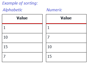
- Sorting mode can be Ascendent or Descendent
- Sorting Rule can be Alphabetic or Numeric
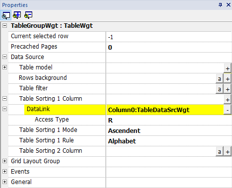
Multiple sorting (STABLE sorting) is useful when a column has repetitions. You can use up to three sort columns.
The table can be ordered even using the SetTableSortingColumn macro (see "SetTableSortingColumn" for details).
Horizontal scroll position
The “Horizontal scroll position” give the possibility to keep synchronized the horizontal scroll movements of two tables.
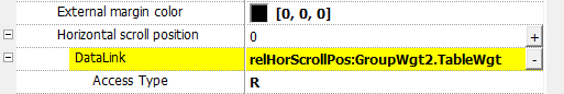
Horizontal scroll position parameter is available only in Advanced Proprieties View mode
Precached Pages
Normally the JMobile HMI Runtime retrieve only the data that will be visible into the display. To make table scrolling more pleasant, it may be useful to preload the data of the next and previous rows of the displayed ones. Using the Precached Pages parameter is possible define how many pages will be preloaded
- 0 = no pages preloaded
- N = number of pages to preoload
Example:
Using a table with 4 rows and Precache Pages = 2
- Number of row to preload are 8 (2 pages x 4 rows)
- 4 rows before (to be ready to manage scroll table up)
- 4 row above (to be ready to manage scroll table down)
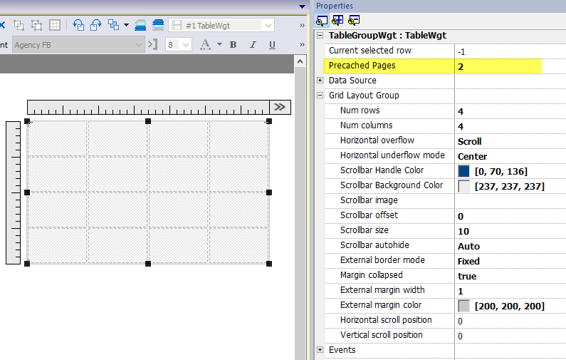
Precached Pages parameter is available only in Advanced Proprieties View mode
Widgets that contain tables
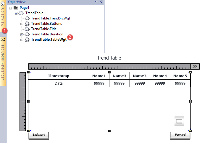
Inside the gallery, there are widgets that contain tables, e.g. trend table, audit table, etc. To open the table's properties or the data source's properties you can use the Object View tab and select the component that you need to configure.
Printing table
A table widget can be found and used from the print report gallery.